Purely

iOS & Android App — UI Design
Project Overview
Purely is a mobile app concept I developed for my UI Design certification. The goal of the project was to design mobile app interfaces for both the iOS and Android platforms adhering to the existing design guidelines.
Challenge
As a long-time iPhone user who is more familiar with the iOS interface, my main challenge was to acquaint myself with the different design patterns between native iOS and Android platforms, and to implement them into the respective app designs in my project.
My Role

UI Design and Visual Design

Finished Project

September 2020

Tools

Sketch, Photoshop, InVision, Google Drawing

Design Guidelines

iOS Human Interface Guidelines, Google Material Design

Deliverables

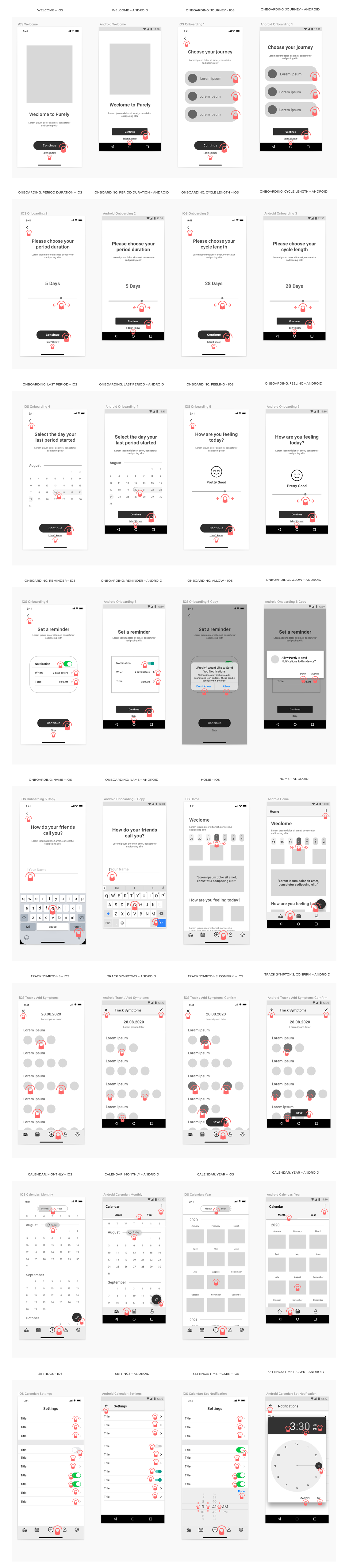
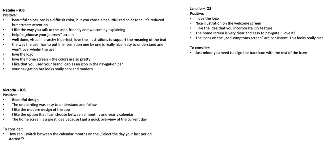
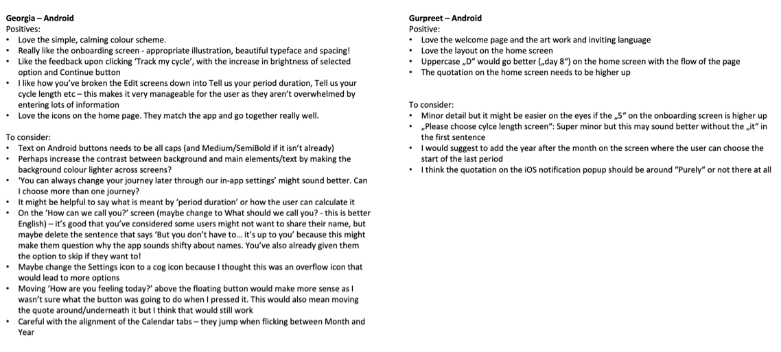
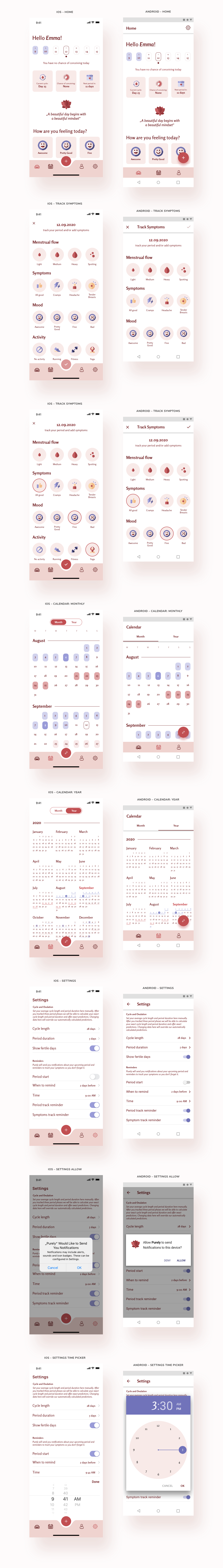
User stories | User Flow Diagram | Logo & Icon Design | Wireframes, Interactive Prototypes and Mobile Mockup (for iOS & Android)

The Process

Concept
After a long research and a lot of downloaded apps I was ready to start with the conceptual phase of my mobile app design. I wrote down the proposal, namely the objective, context, users and key features of Purely.
Objective
Women and girls can track their periods with Purely. The app is intuitive and easy to use. Purely wants to make it fun and enjoyable to track the period with a nice calendar view and helpful notifications.
Context
It’s obvious that this is not the favourite time of the month for a lot of women and girls out there. Purely wants to make it less bad by giving the users a good, relaxed and comforting feeling after using the app with little things like a positive, motivational or inspiring quote on the home screen. Because it's the little things that matter and that can make a difference.
Users
This app is for women and girls who want to digitally track their period, get reminders about birth control pills or who want to get pregnant.
Purely provides an easy way of doing this so the women out there don't have to stress about their periods, pills and reminders.
Key Features
· track period, mood and all period related data and symptoms
· get an overview over their past and predicted periods and ovulation phases for the next months
· set notifications and reminders for the period and ovulation phase
User Stories & Flows
To get a better understanding of the tasks and goals my users will perform in the app, I created three user stories with the subsequent user flows and combined it into a single user flow diagram.
User Story 1
When I have my period, I want to track it and save all my accompanying symptoms, so I always have an overview of my period and can e.g. check on my last period and compare symptoms to be prepared.
User Story 2
When I’m thinking about plans and vacations for the next weeks/months, I want to have a prediction for my period and ovulation phase for the next months in a calendar, so I can prepare myself and plan better to feel safe and comfortable.
User Story 3
When I’m about to get my period/ovulation, I want to get notifications in advance and reminders to trackduring my period, so I don’t forget about it.
User Flow Diagram
Low Fidelity Wireframes – iOS
Based on the user flow diagram I sketched the low fidelity wireframes with pen and paper. I decided to sketch the iOS version and create the Android version in the next step with the mid fidelity wireframes.
Mid Fidelity Wireframes – iOS vs. Android
I converted my low fidelity wireframes into digital mid fidelity wireframes using Sketch. Following the iOS Human Interface Guidelines and the Google Material Design I created each screen for iOS and Android.

Material design recommended using 4-column grids for mobile breakpoints that are less than 600pt, while iOS emphasized restricting content inside a safe area without specifying a cohesive grid system. Considered the complexity of content and function of the app,  I have chosen to use a 12 column grid in both the iOS and Android interfaces to allow optimal flexibility for placing UI elements in various layouts.
Sounds, Physical Feedback & Mobile Gestures
Sounds & Physical Feedback
Since the menstrual cycle is a very sensitive topic for a lot of girls and women I wanted to be careful with my decisions regarding sound. Especially when the users open the app in public they oftentimes don‘t want others to notice it or look at their screen. Sound attracts attention and since this is a sensitive and private topic, I decided to not include sound at all. I wanted to focus on the typical iOS and Android vibrations.
Mobile Gestrures
To show how a user will interact with interact with my UI, I indicated gestures on my mobile wireframes to focus on gesture-driven design. To double-check for problems, before moving on with the high fidelity wireframes, I build an interactive prototype.

At this point I realized that my design is missing some really important screens – the onboarding. With these kind of apps it's important to get to know the user in oder to personalize the whole user experience. The app can't work without user input and data. I have to know the journey that my user wants to take with the app and all relevant information regarding their menstrual cycle.
Logo Design
I wanted to create an unique logo that is different to the other ones on the market. That was not an easy one, because there are a lot of competitors out there. After sketching some ideas with pen and paper I decided for a pure lotus logo without lettering.
High Fidelity Wireframes
After a successful testing session with my mid fidelity wireframes it was time to create the high fidelity wireframes and test these on users. I searched for female participants for both, iOS and Android.
iOS Wireframes
Android Wireframes
Prototyping & User Feedback
In order to let my participants give me valuable feedback on my high fidelity wireframes I created two prototypes in InVision. One for iOS and the other one for Android. I recruited participants that are heavy users of their respective operating system.
View iOS PrototypeView android Prototype
Feedback Loop
Based on the valuable feedback that I received from my participants I adjusted my iOS and Android wireframes and created my final UI design.
Final UI Design
After another feedback round with my mentor I decided to change some elements in my designs according to his professional and constructive feedback. I deleted the line on the bottom of the fixed navigation bar on top of the screens and I changed the info boxes on the slider (home screen) and recipe overviews. Finally, I created mockups to showcase my final UI design.