ZEIO

iOS App — UI Design
Project Overview
While pursuing my UI Design Certification at Career Foundry, I was tasked to create an intuitive and engaging mobile user interface that evolves users’ emotions. A music player app has come on top of my mind – I was motivated to create a visual-appealing and easy-to-use music app!
Motivation
Music has always been a huge part of my life and is always a part of my daily routine. It helps reducing stress, improving my mood and has also the ability to let me focus on tasks. As I enjoy listening to different types of music based on how I feel and what I am doing, I like using music player apps to help me with exploring playlist and broadening my musical horizon.
My Role

UI Design and Visual Design
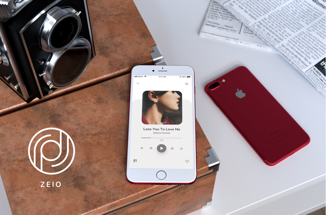
Finished Project

April 2020

Tools

Sketch, Photoshop

Deliverables

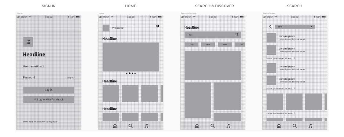
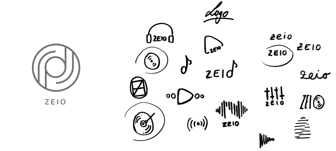
Low-to-Mid Fidelity Wireframes, Icon & Logo Design, Final Design Mockup

The Process

Defining the problem
Raymond Loewy’s MAYA Principe has taught me the importance of creating advanced designs while balancing users’ well-known present. To identify common patterns that users are familiar with, I analyzed the design and app structure of existing music apps on the market to identify the key functionalities - my design problems for the project. I then determined the appropriate UI patterns to help me with solving each problem.
Key Functionalities & UI Design Patterns
Grid Design on Mid Fidelity Wireframes
I digitalised my low fidelity wireframes and created mid fidelity wireframes. To establish a consistent design and layout across all screens I created a grid design. After researching on different layout and grid options, I decided to implement the 8px Grid System on my wireframes.
Layout Design and Spacing
Visual Design
Symbols & Iconography
I created an own set of icons using Sketch to best fit my overall app design. Rounded corners bring friendliness and easiness to the app. Evolving an inviting and engaging vibe.
Logo Design
In order to get some ideas for the logo I did some brainstorming and sketched out some ideas that came to my mind.
Inspiration Board
I wanted to create a modern, simple and harmonious app design. To decide for a color palette, typography and emotions I want to evoke in the user, I decided to create an inspiration board to visualise my vision.
Style Guide
I decided to use a subtle beige and desaturated brown as the dominant and support color. Why is beige such a great color? Marianne Shillingford says: "We’re falling back in love with naturals. They are versatile and make us feel uplifted, comfortable and energised". This is what I wanted for my app. When a user is listening to music they're often "in their own world" and feel comfortable. I want to evoke this emotion. Furthermore my vision was to create a total different app design than those from competitors. Music apps are often dominated by dark colors like black and supported by neon colors. Since my aim was to create a simple, yet harmonious and comforting design, I chose subtle colors like beige and brown.

For typography I chose the great font family Nunito. It's a simple rounded terminal san serif. This font fits best to my overall app design, since the icons, logos and elements are all rounded.
Final UI Design